Case: KVINT Consulting Partners
Five Lines.
One Clear Direction.

Project facts
Colaboration
KVINT Consulting Partners
Studio Génial - Stephanie Barbon
My work
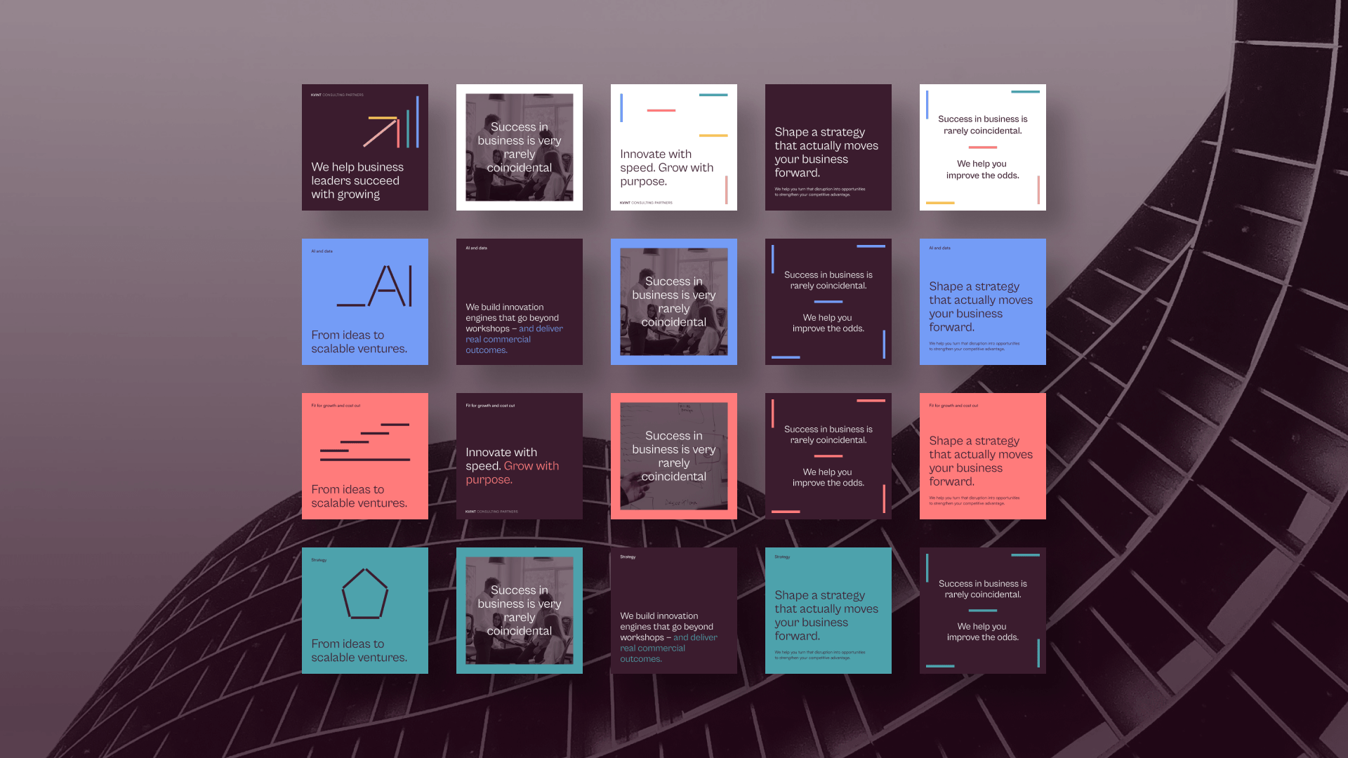
Visual identity
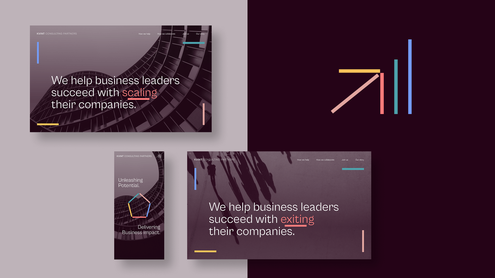
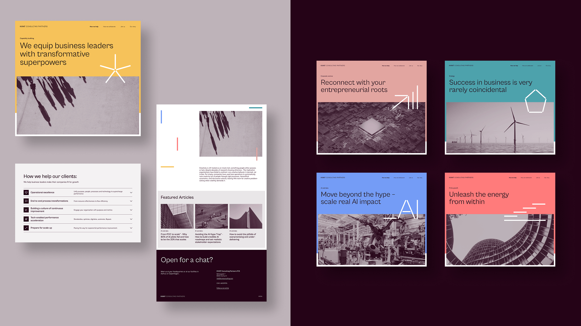
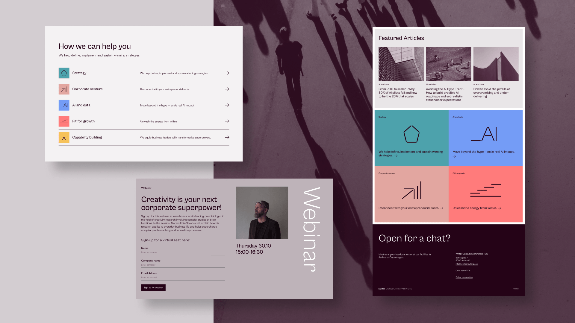
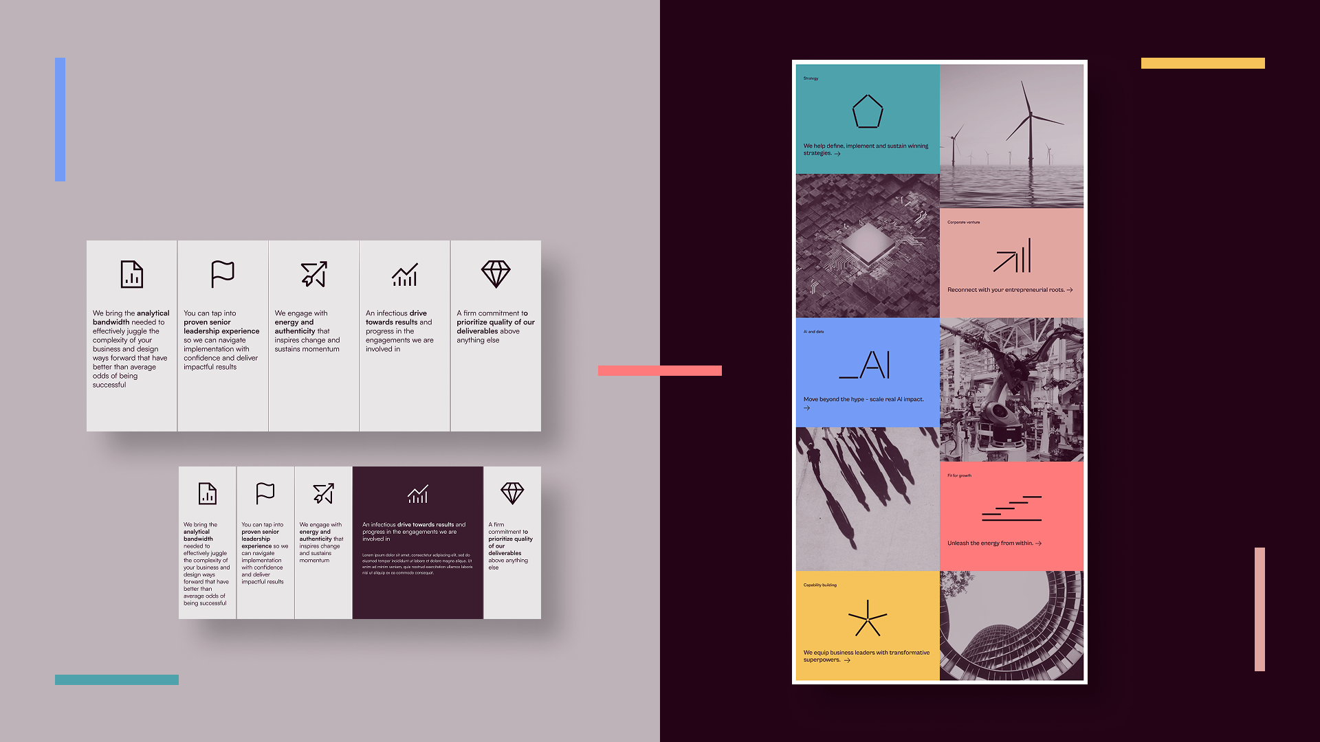
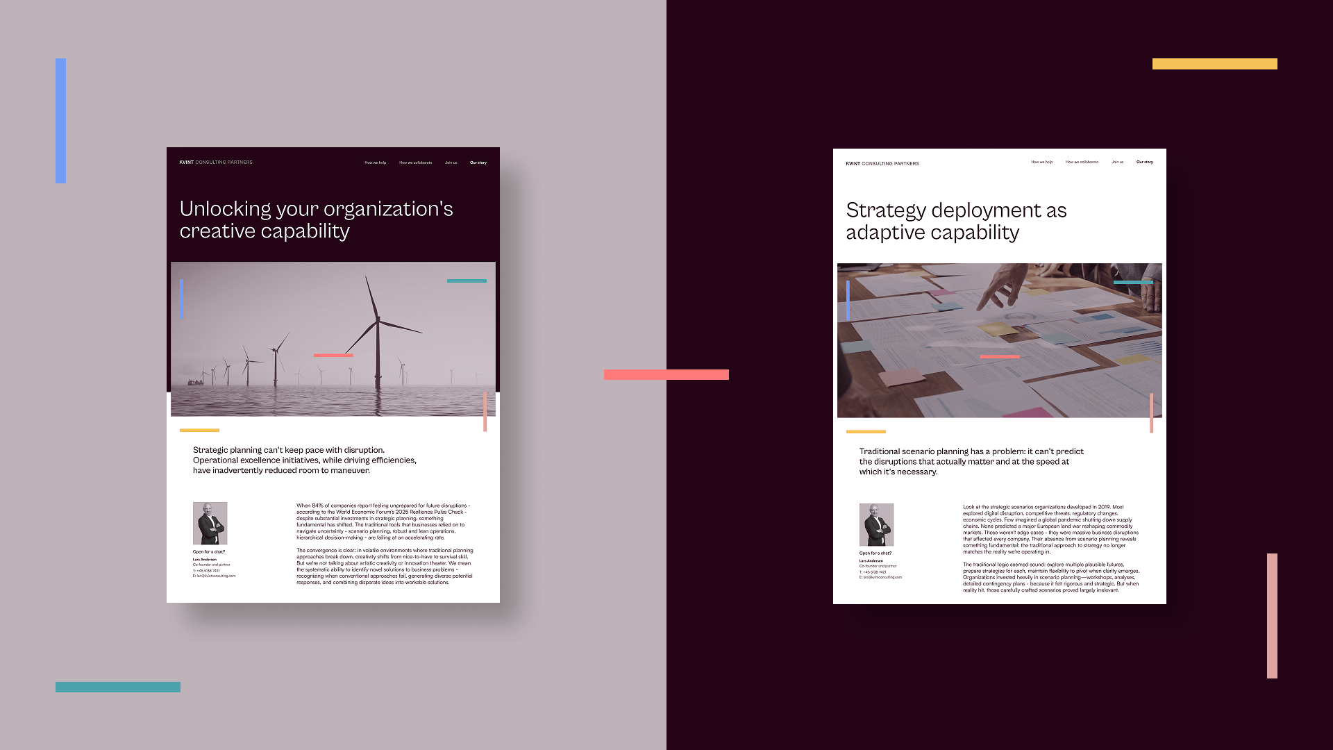
Website Design & UI elements
KVINT Consulting Partners is a management consultancy focused on clarity, transformation, and strategic progress.
The project centered around defining a distinct visual identity and digital presence — built on a single, unifying idea translated into a flexible and expressive design system.
I led the design direction and execution, creating the visual concept, identity, logo, color palette, iconography, and website — shaping a modern, human, and clearly differentiated consulting brand.
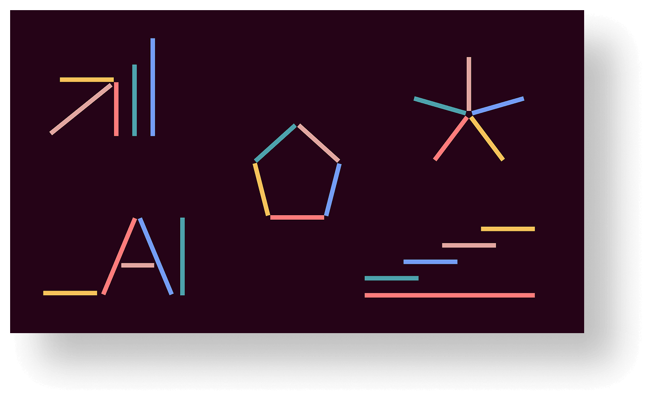
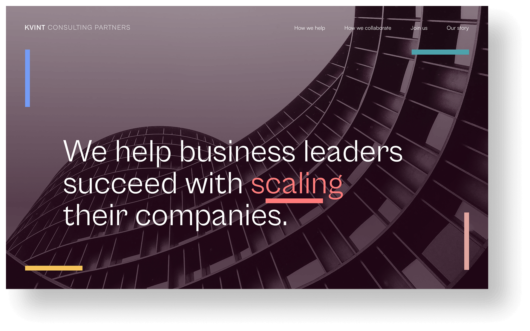
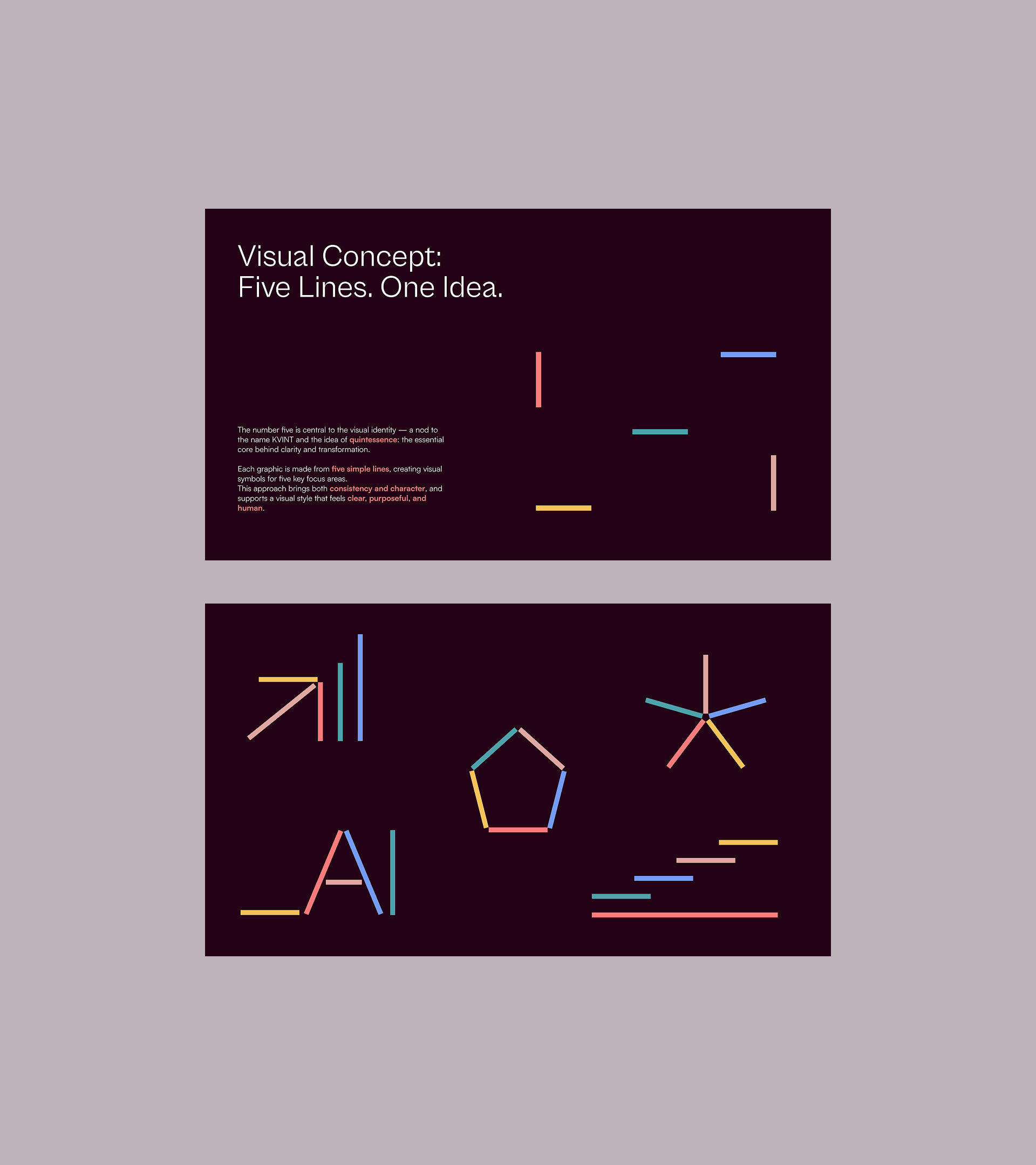
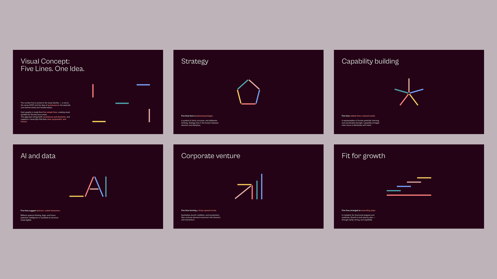
The visual identity for KVINT is built around one clear idea: removing complexity and focusing on what matters.
Inspired by the idea of quintessence, the concept is about finding the core and cutting away everything unnecessary.
A simple visual system based on five lines creates a strong and flexible brand language, where every graphic element follows the same foundation.
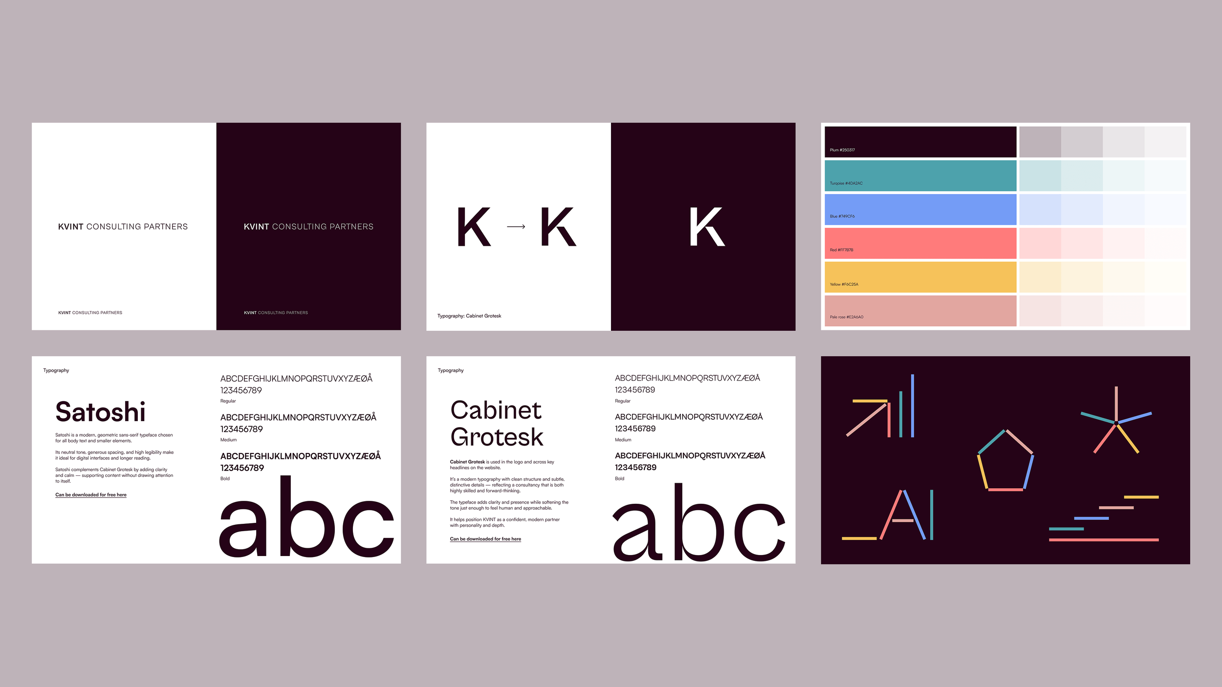
Clean typography, generous spacing, and a balanced colour palette support the expression. A deep plum tone adds depth, while lighter accents bring freshness and contrast.
The result is a modern consulting identity that feels clear, approachable, and focused.