Case: Liebe
Redefining luxury property sales
Project facts
Colaboration
Liebe
Studio Génial - Stéphanie Barbon
My work
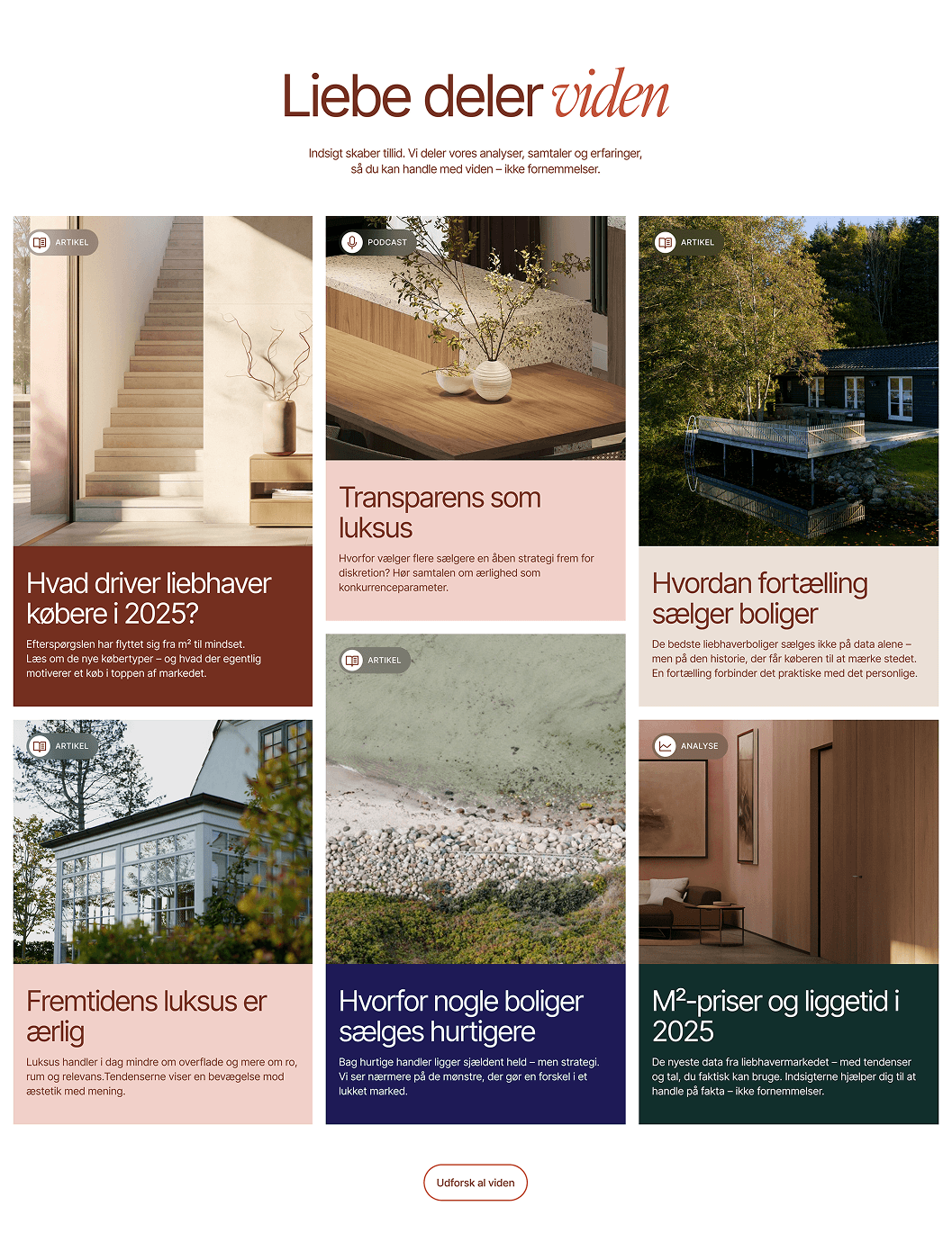
Visual identity
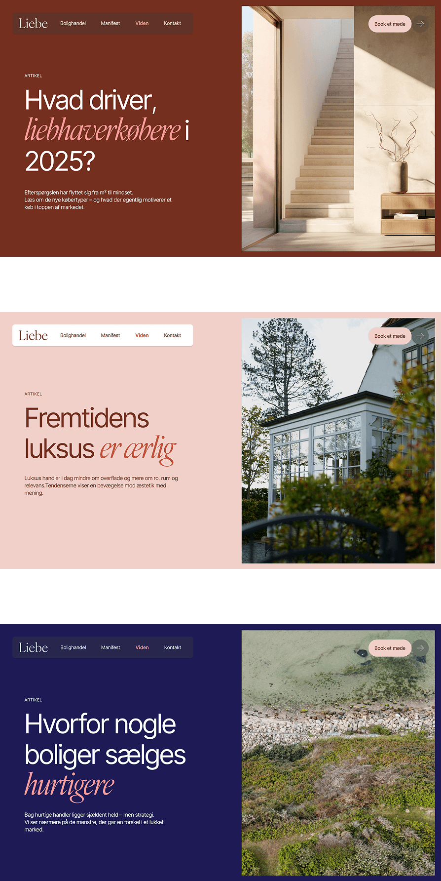
Digital experience
Website Design & UI elements
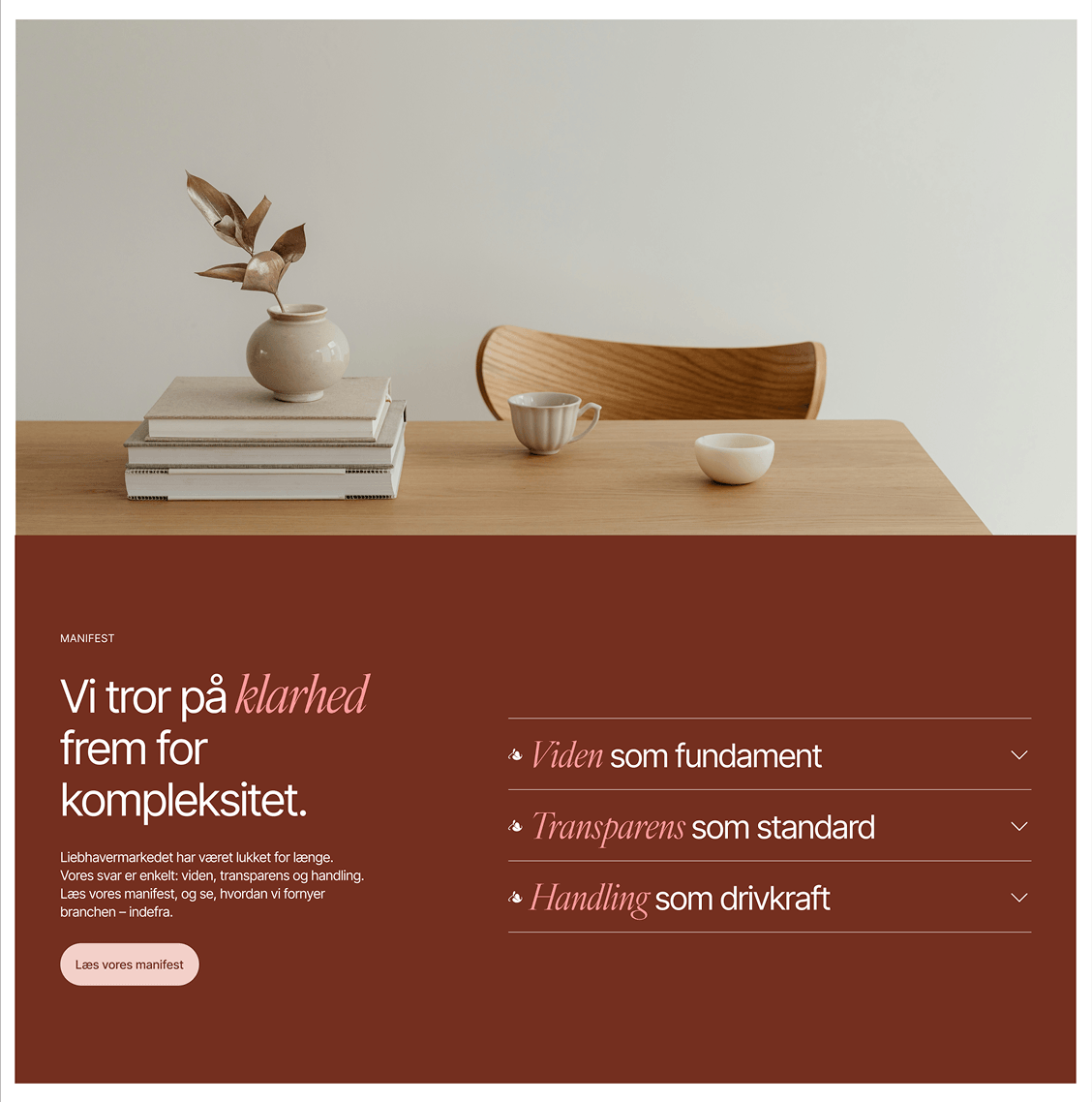
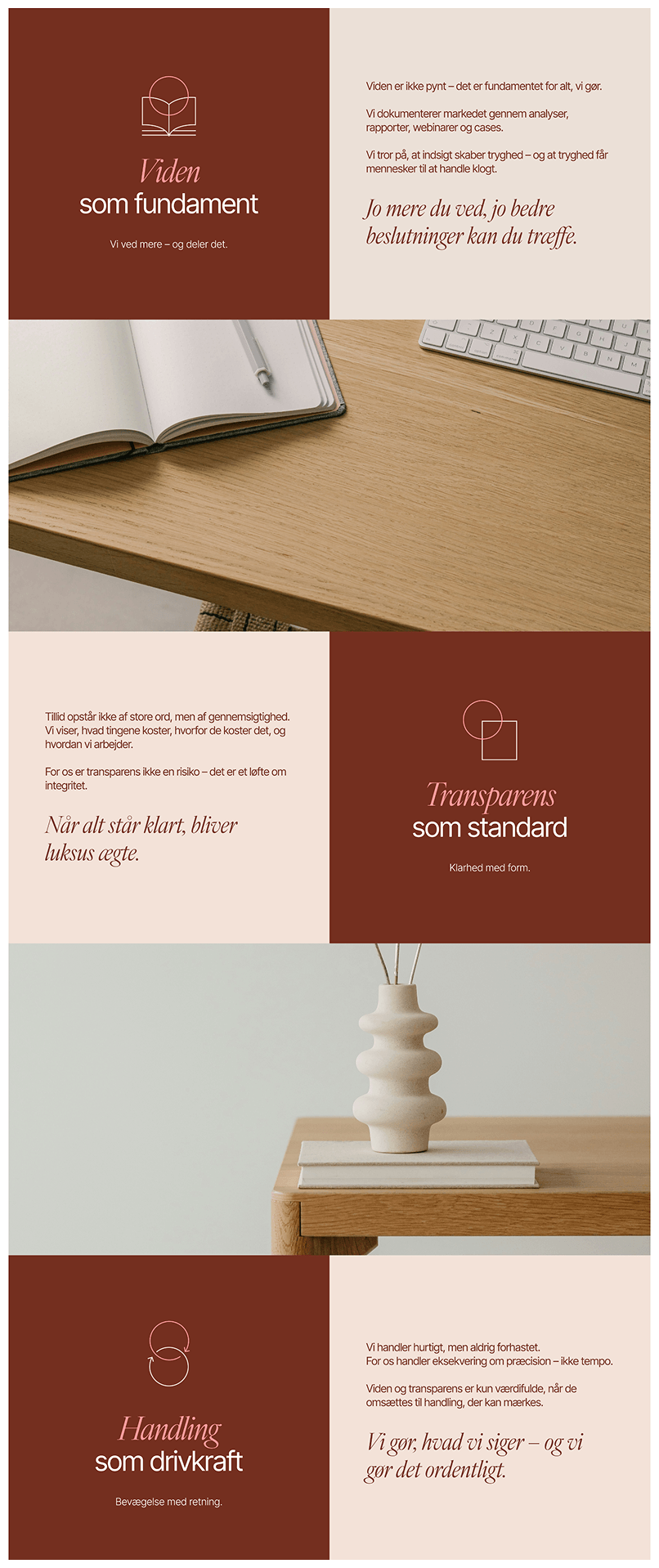
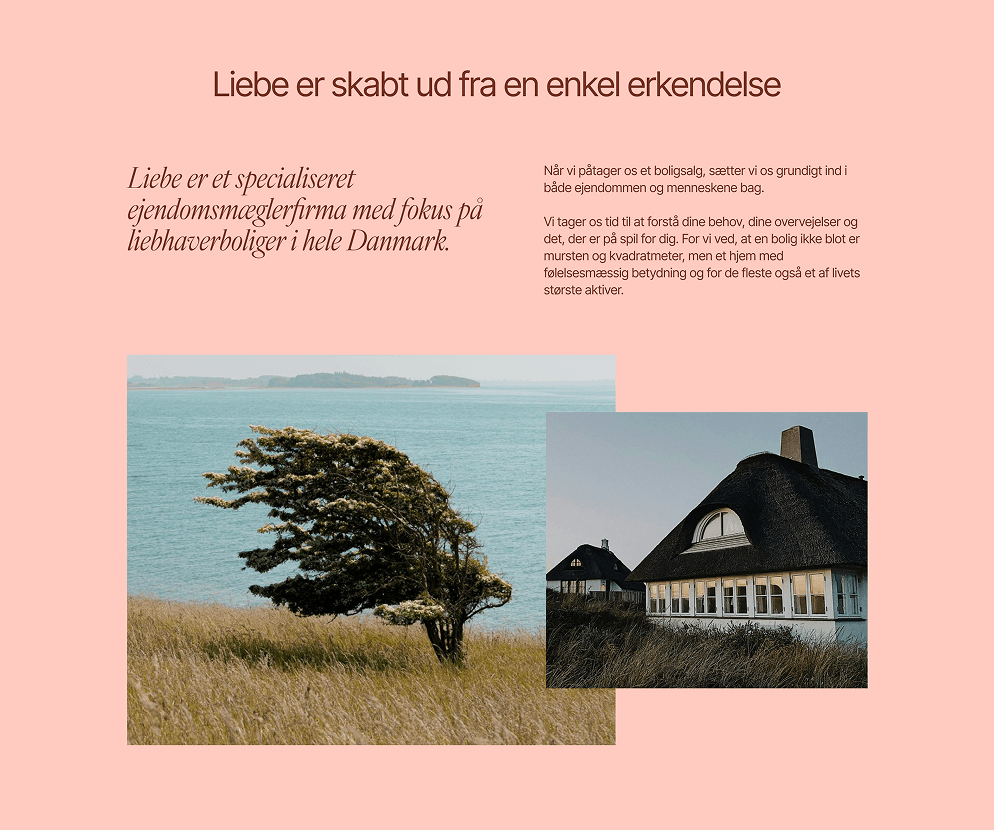
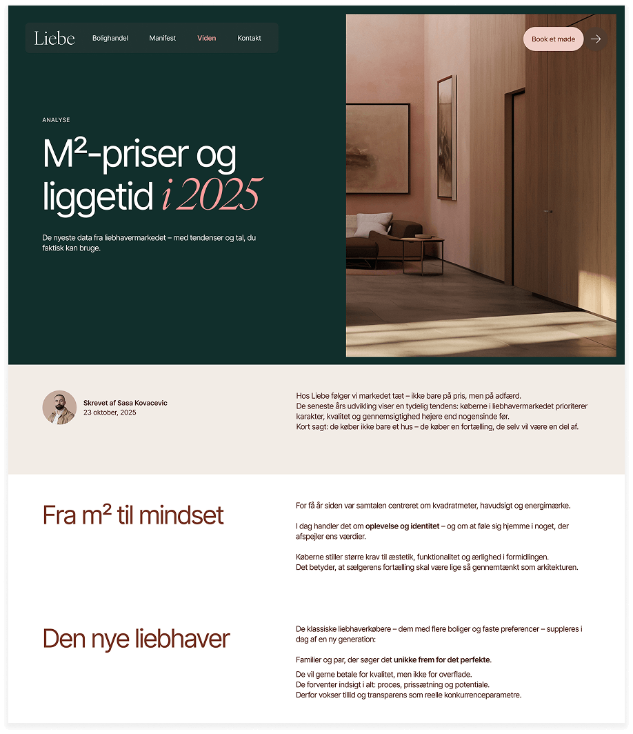
Liebe was created to challenge the traditional luxury real estate market by replacing distance and exclusivity with transparency, knowledge, and trust.
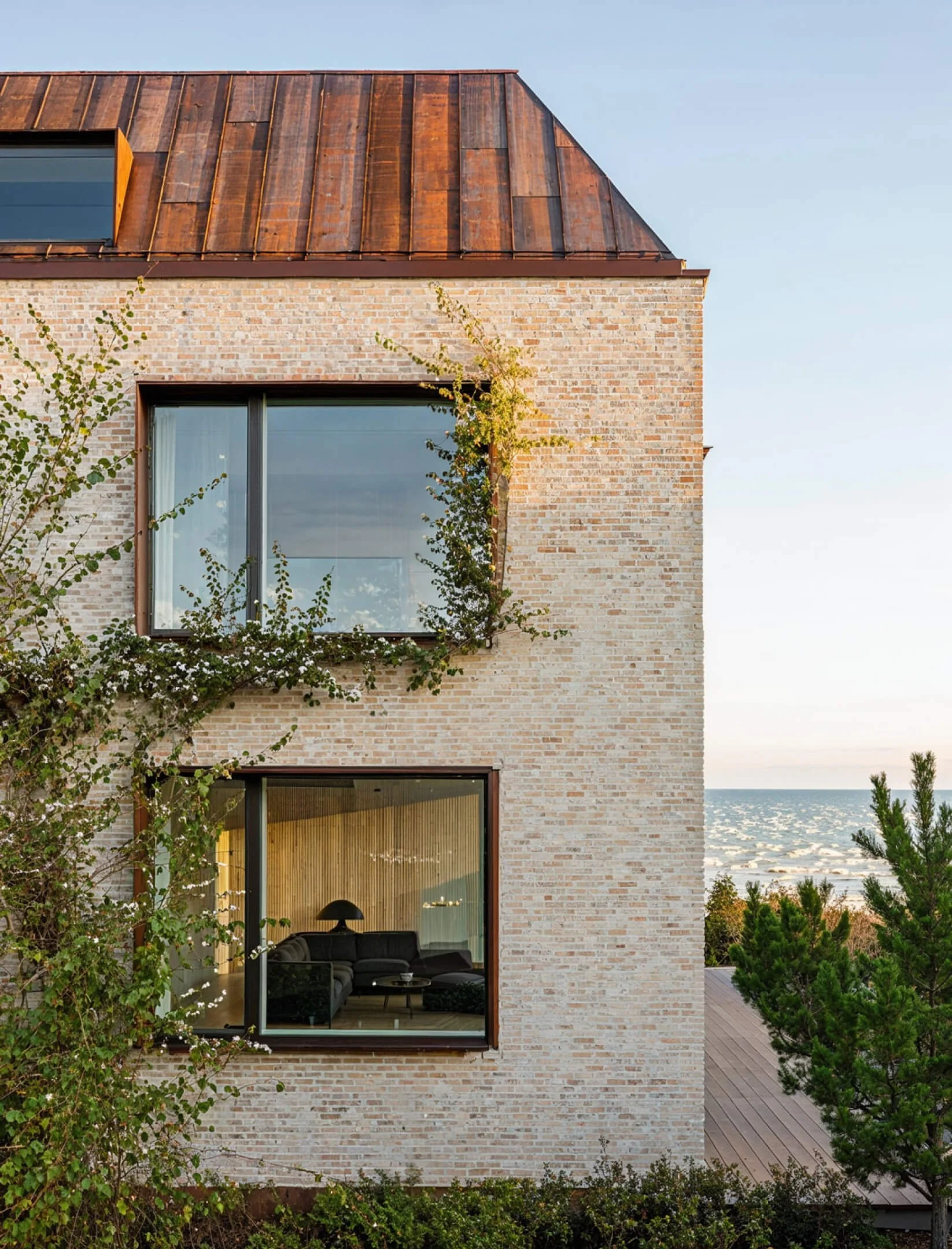
Rather than focusing on polished perfection, the brand is built around honesty, insight, and a more human approach to property sales. Luxury is not defined by price alone, but by architecture, craftsmanship, history, and the feeling of home.
The goal was to create a premium brand that feels intelligent, warm, and quietly confident — where expertise and trust become the true luxury.
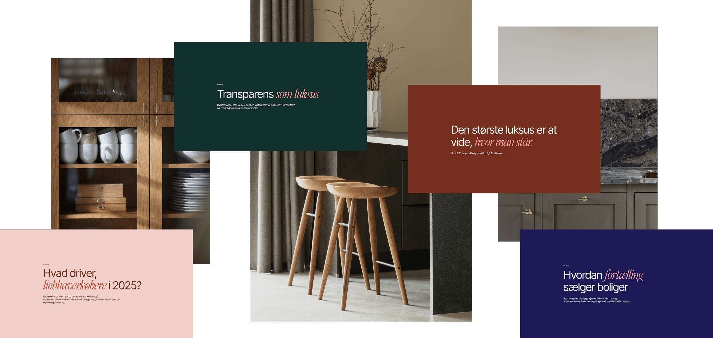
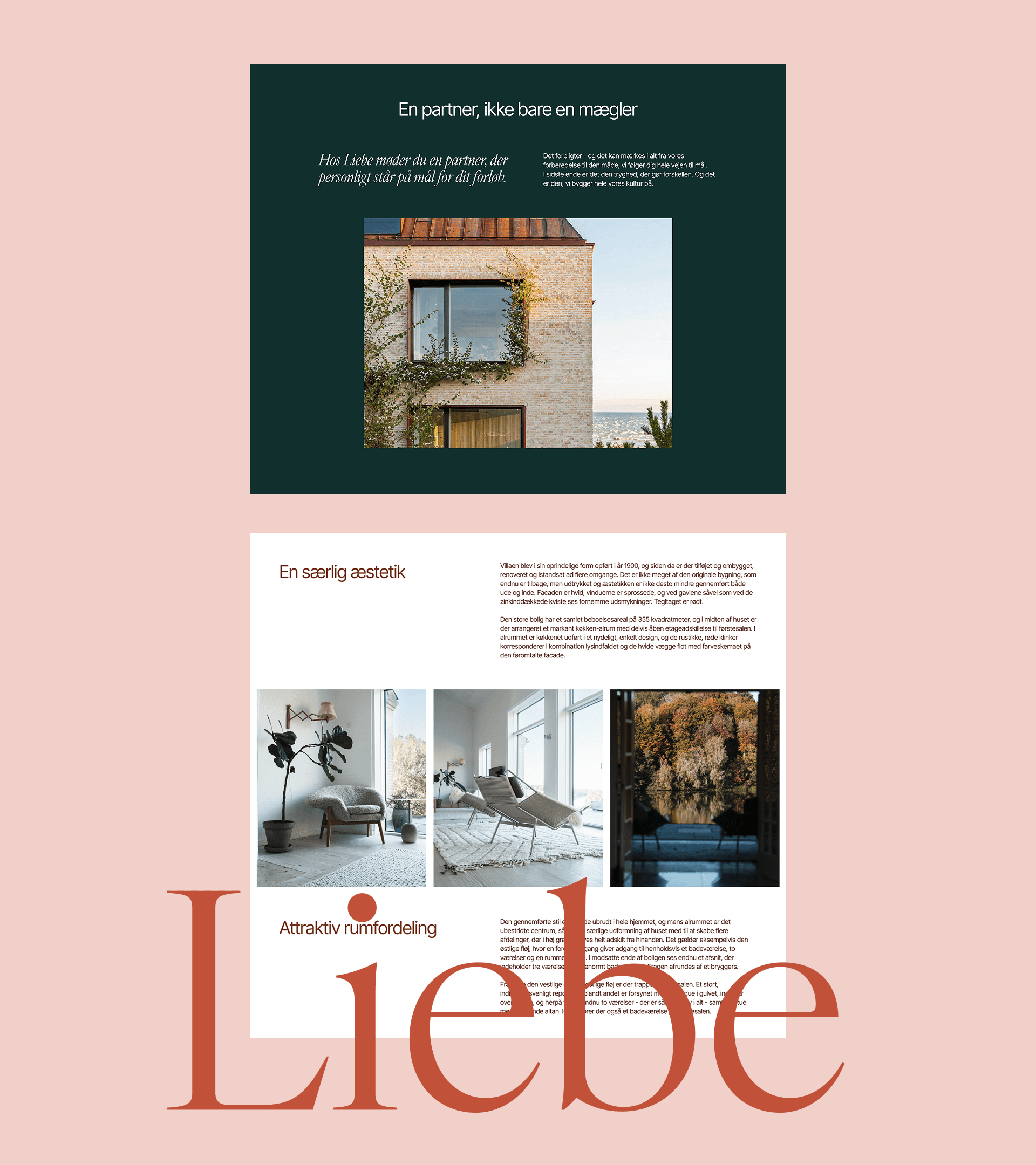
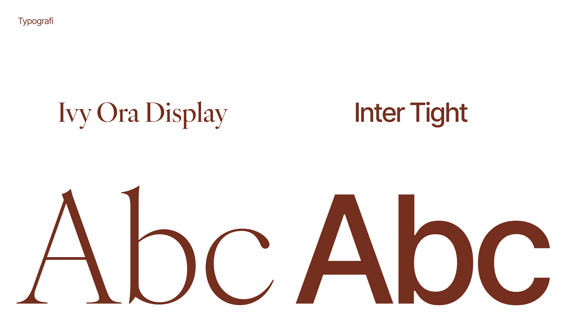
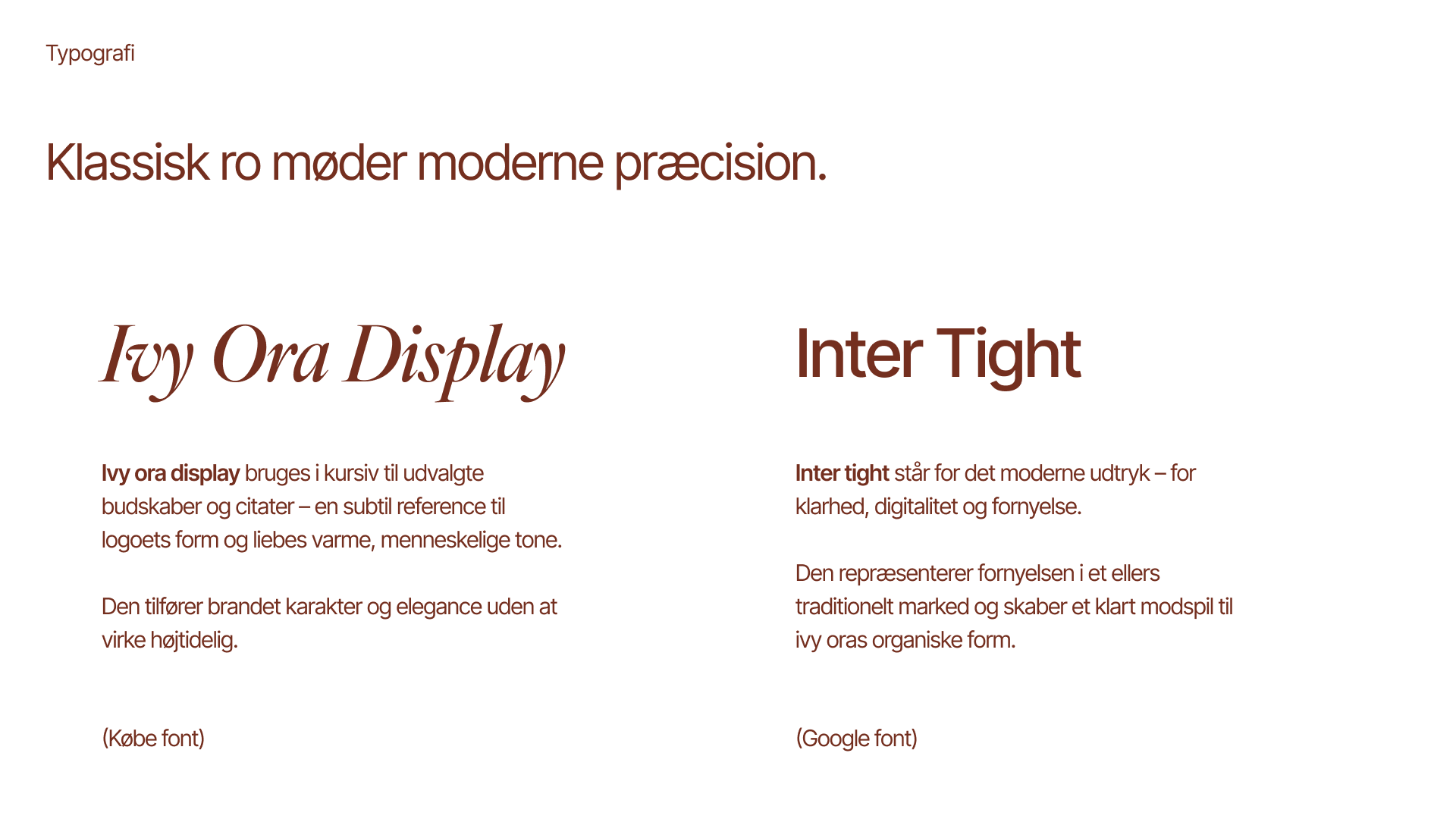
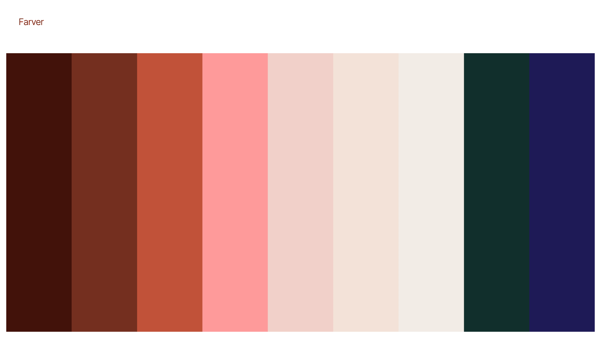
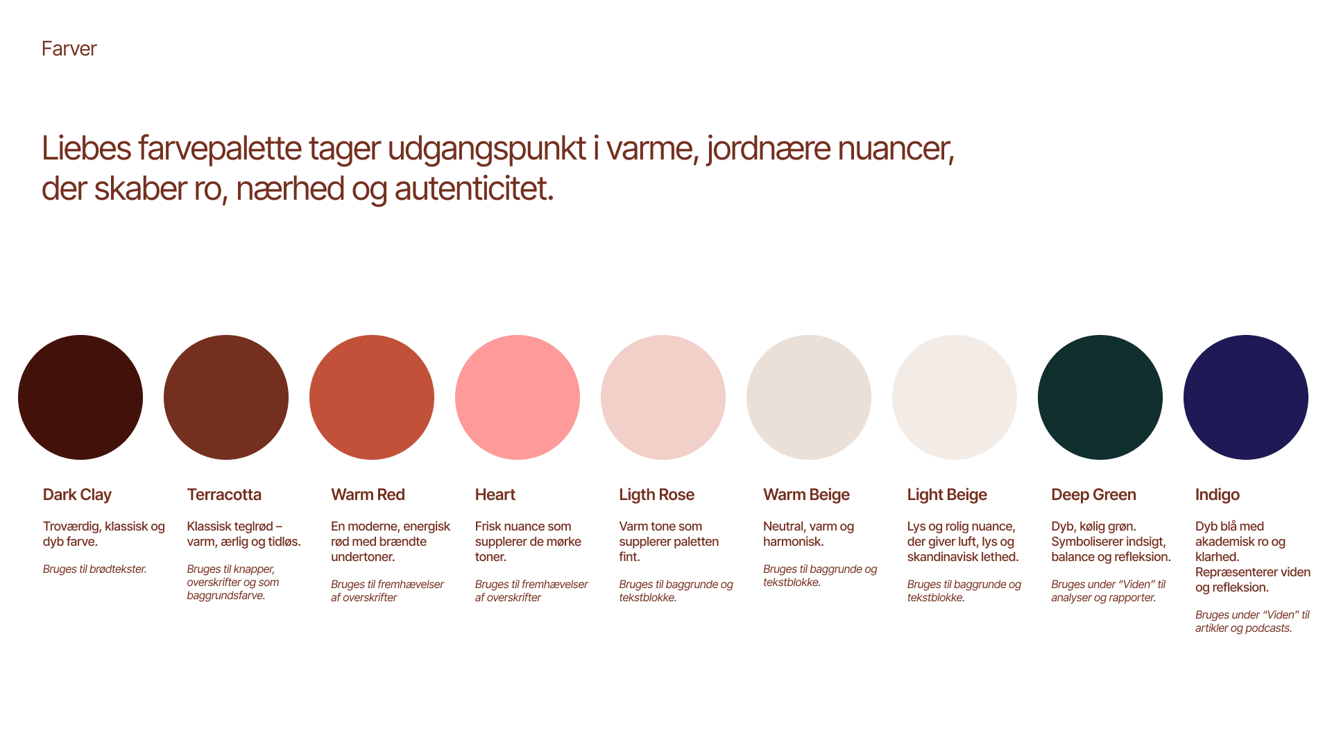
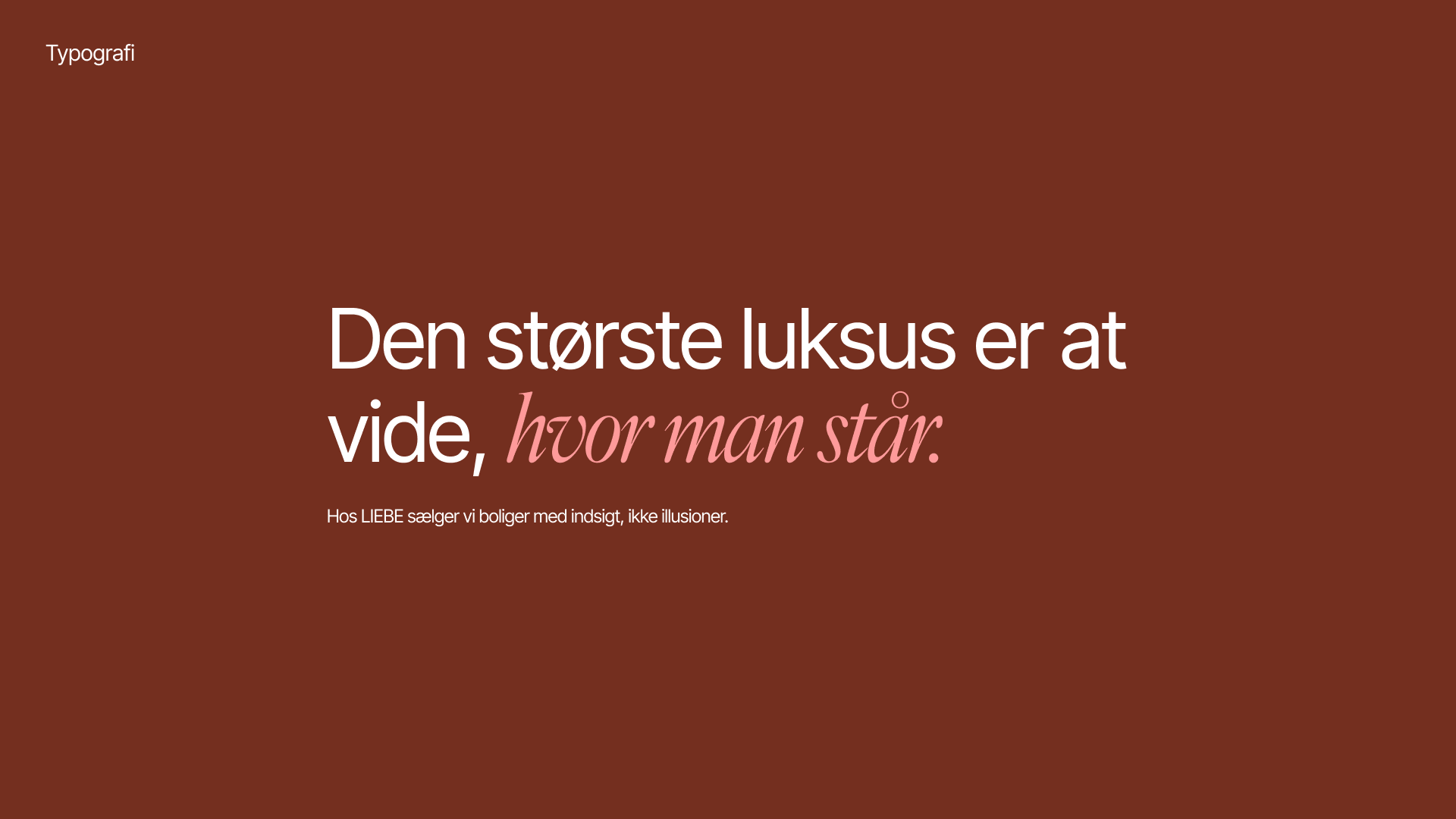
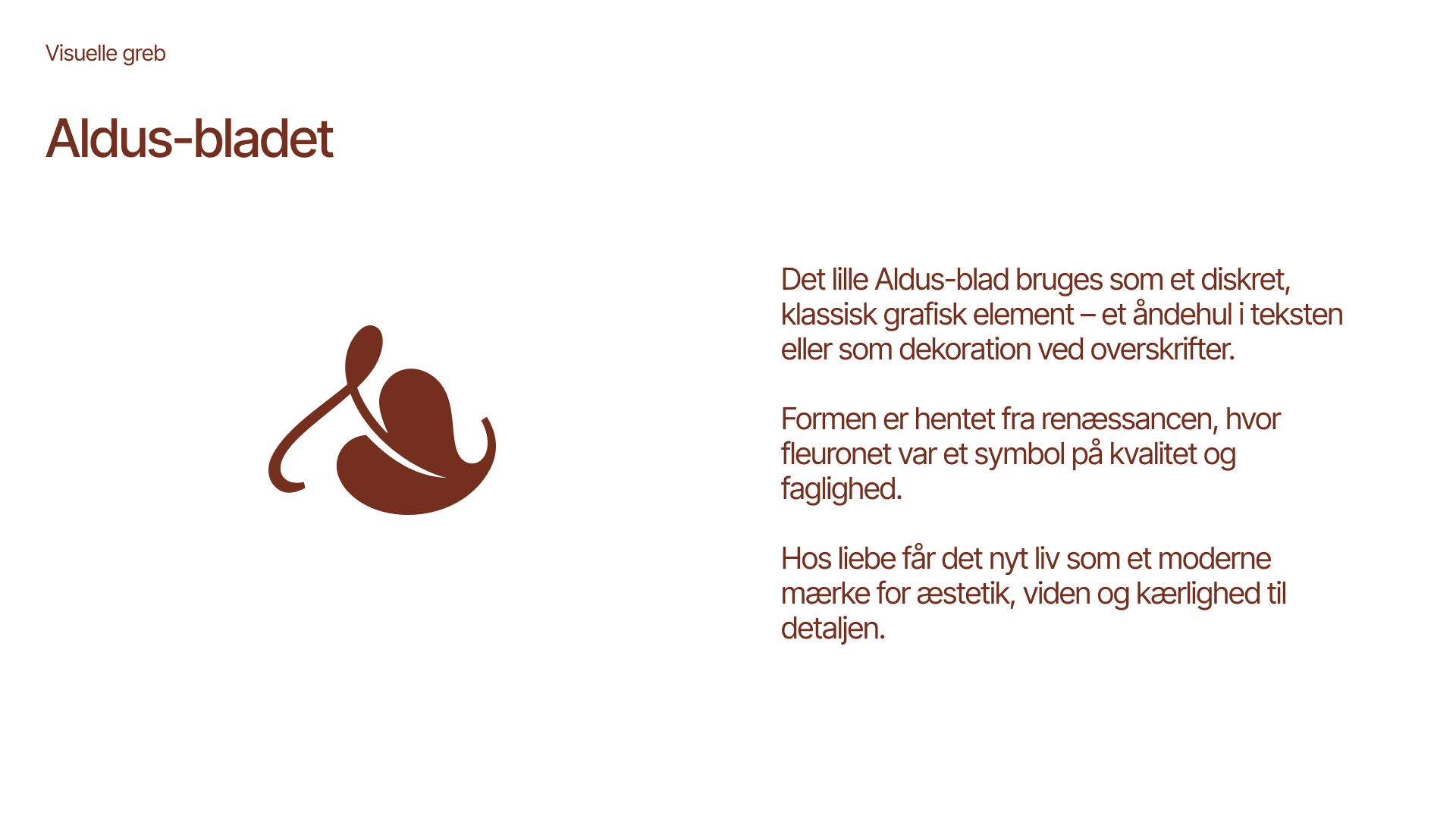
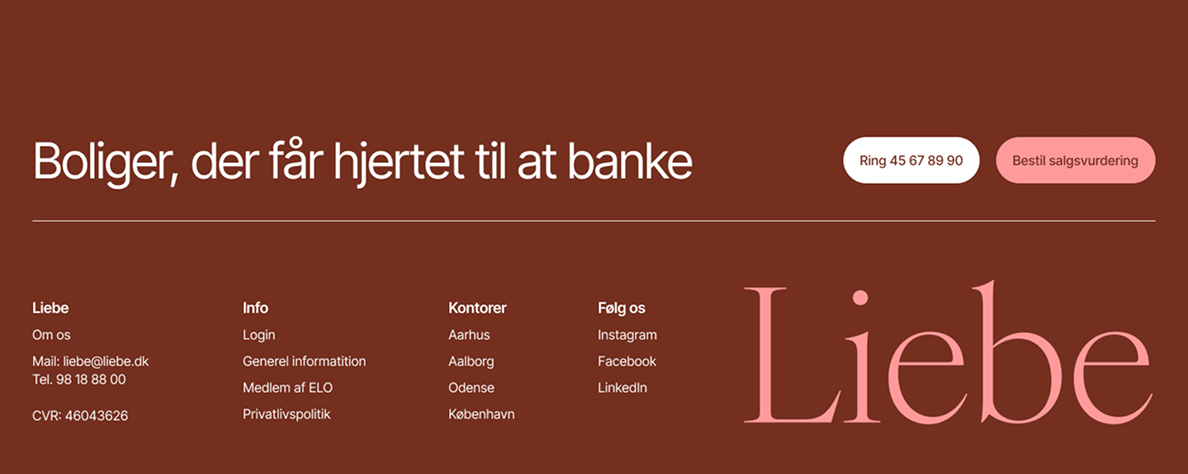
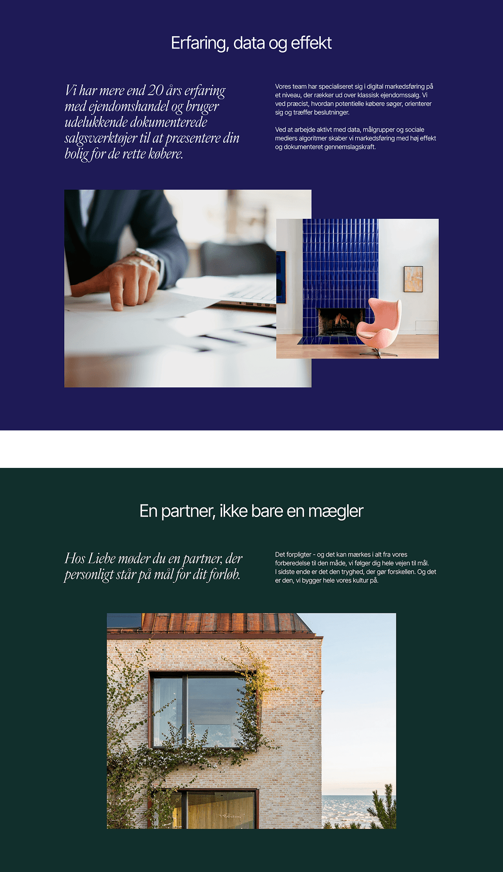
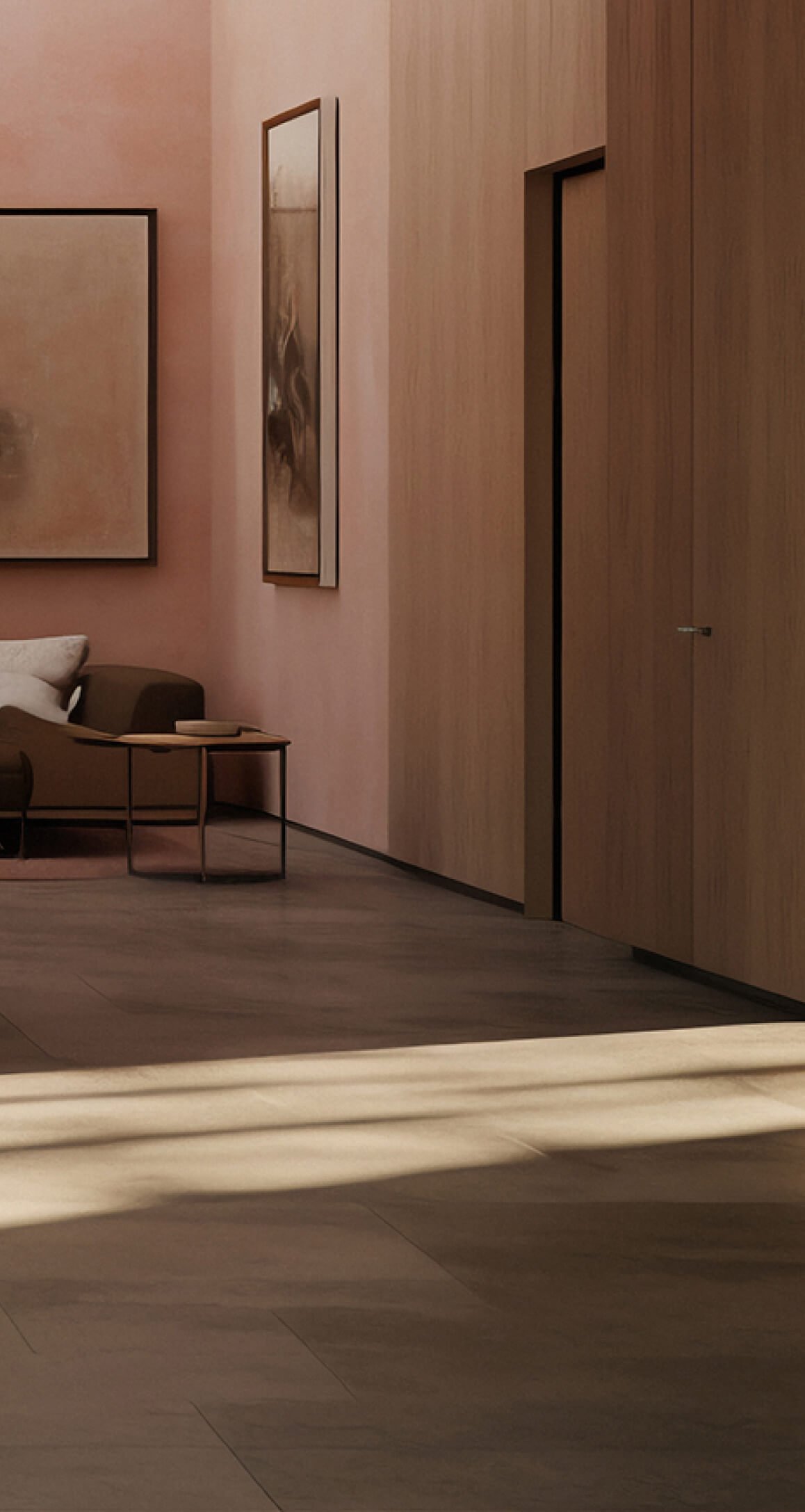
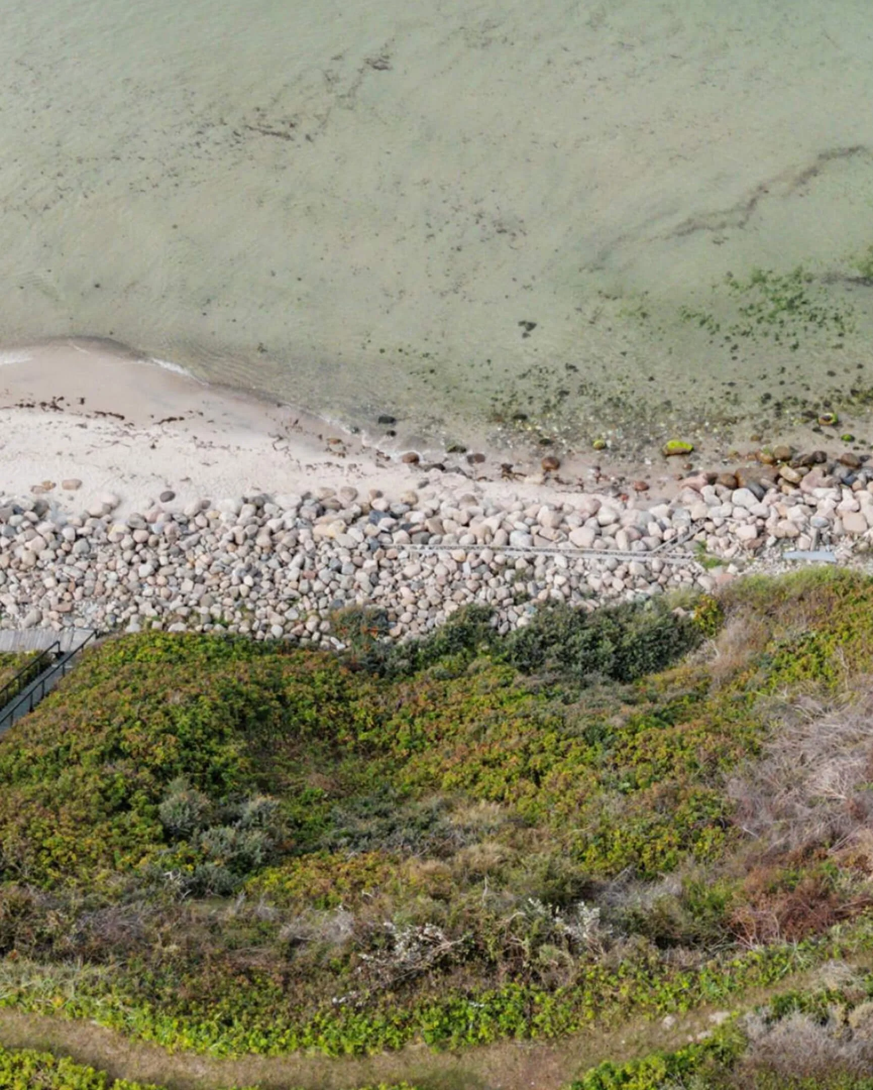
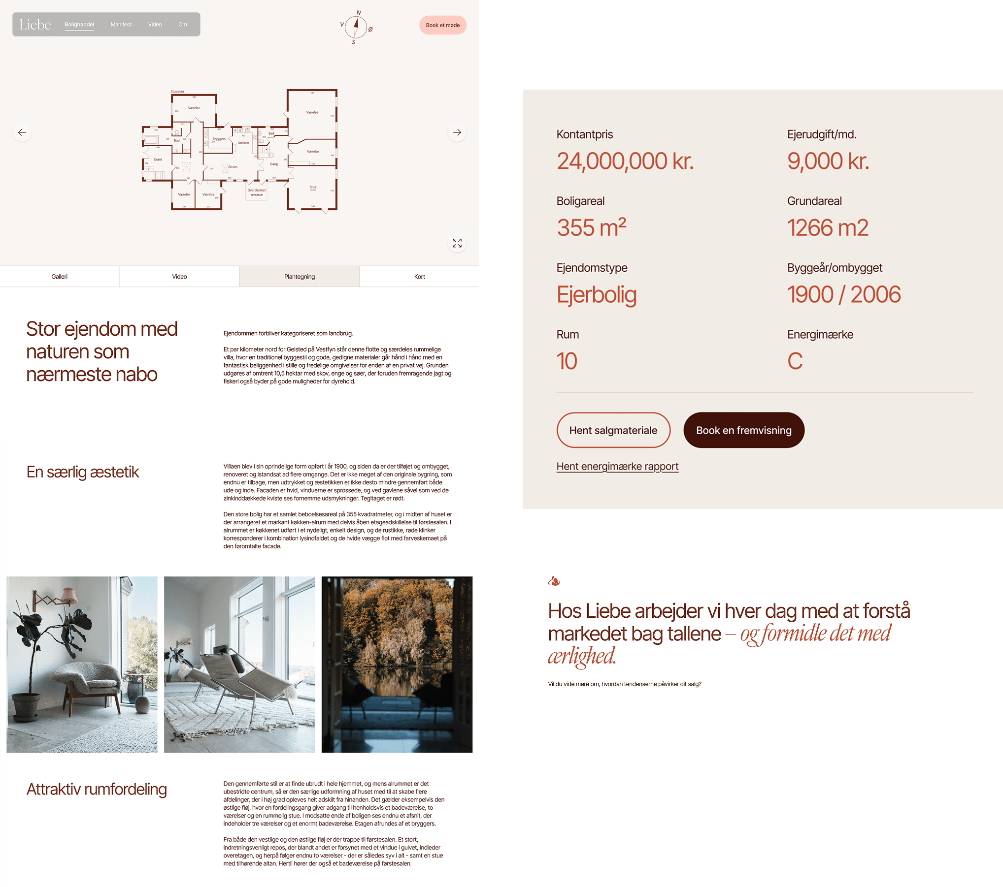
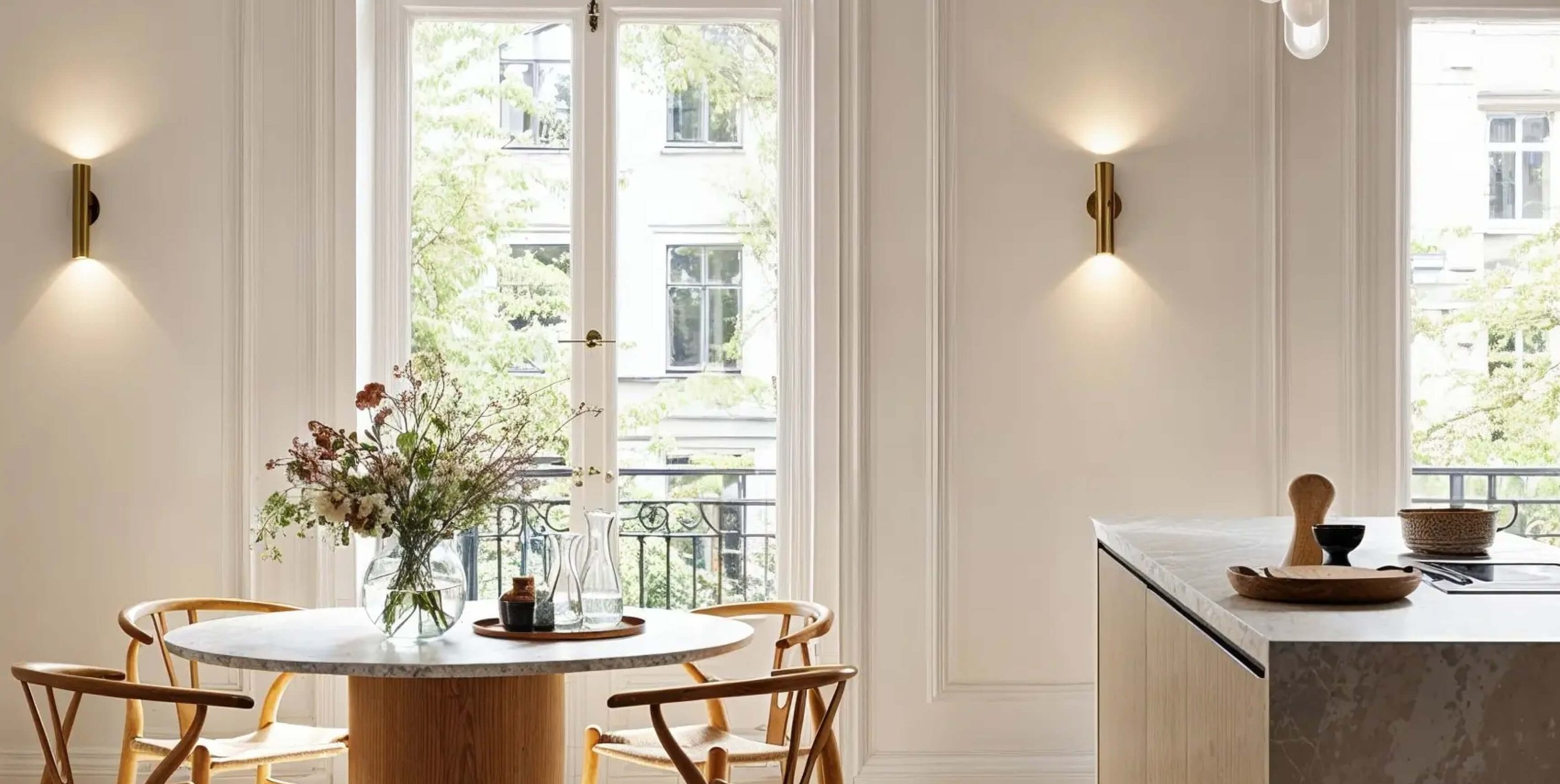
The visual identity combines warm earthy tones, refined typography, and editorial details to create a calm and elevated expression.
Terracotta acts as the emotional core of the palette — inspired by natural materials, architecture, and the feeling of home — while soft neutrals bring balance and Scandinavian lightness.
Elegant serif typography adds warmth and character, supported by modern sans-serif clarity for digital usability. Blurred transparency effects, subtle graphic elements, and carefully curated imagery create depth without visual noise.
The result is a modern luxury brand that feels more like trusted advisory than traditional brokerage — premium, but approachable.